Use this primary colors art lesson for children to teach about color theory and the famous artist Piet Mondrian.

Piet Mondrian primary colors art lesson for children
This primary colors art lesson for children is part of our color theory lessons curriculum within our art lessons and craft activities for children.
In this lesson you can:
:: learn what color is
:: learn about the color wheel and primary colors
:: learn about the famous artist Piet Mondrian and see examples of his work
:: think about how science and math relate to art
:: use mathematical language and concepts including shapes, squares and rectangles; fractions; angles of 90°; parallel and perpendicular lines; area and perimeter
:: learn about street maps and grid construction
:: make a piece of art inspired by Piet Mondrian, using primary colours
Get all our Color Theory art lesson plans
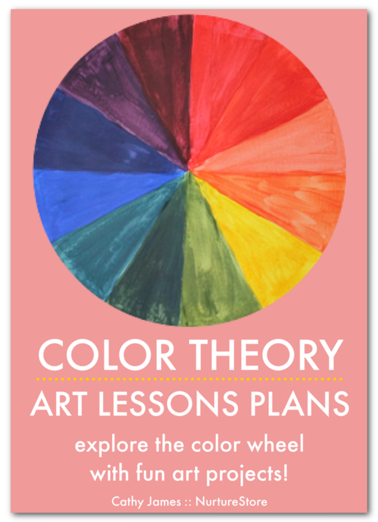
Use our ready-made Color Theory Art Lesson Plans to explore the color wheel with creative art projects. Our Color Theory curriculum gives you all the resources you need to learn about the color wheel and color theory and enjoy easy and fun art projects for every lesson.
The kit includes art history guides, famous artist profiles, and wider cross-curricular lessons in science, math, language arts and world culture, plus bonus printables and posters to make your teaching even easier.
See more details of our Color Theory curriculum and get your copy here.
Watch this art lesson about primary colors
Watch this video to see me teach this primary colors art lesson. Join in with this easy step-by-step art tutorial about color theory and create your own art project in the style of Piet Mondrian.
Click play to watch the video or join NurtureStore’s art classes on YouTube! on NurtureStore’s YourTube channel. Don’t forget to subscribe!
What is color?
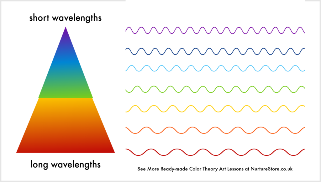
Light, for example from the sun, is made of different waves of light. The waves of light can bounce of different surfaces and they are reflected back to our eyes. We see these waves of light as color.
Some of the waves in light are long and some are short. If short waves of light are reflected to our eyes, we see purple or blue colors. If long waves of light are reflected into our eyes, we see red.

The color wheel
Above you can see a picture of the color wheel. This represents all the colors of light as spokes on a wheel. Starting with red you can see all the other colors through orange, yellow, green, blue, and purple. In our color theory lessons we’ll be taking the colors on this wheel and grouping them together in different ways and using them for our art projects.
You might have noticed there is no black or white shown on the color wheel.
If the light we see is made of all the different wavelengths of light in equal balance, we see this as white.
When there is no light at all, there is darkness. We see this as black.
Scientists and artists can think of color in different ways. Scientists might describe color as short or long waves of light. Artists can use color to show feelings or meaning. Let’s look at how one artist uses color in his paintings.
Meet famous artist Piet Mondrian
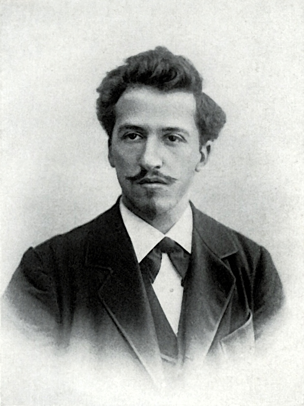
Piet Mondrian was a Dutch artist. He was born in Amersfoort, Netherlands in 1872 and died in New York city in 1944. He was a member of the De Stijl art group.
He is famous for his abstract art paintings. Abstract art is art that does not try to show realistic or recognisable pictures, such as of people or flowers or buildings. Abstract art uses shapes, colours and textures to make art.
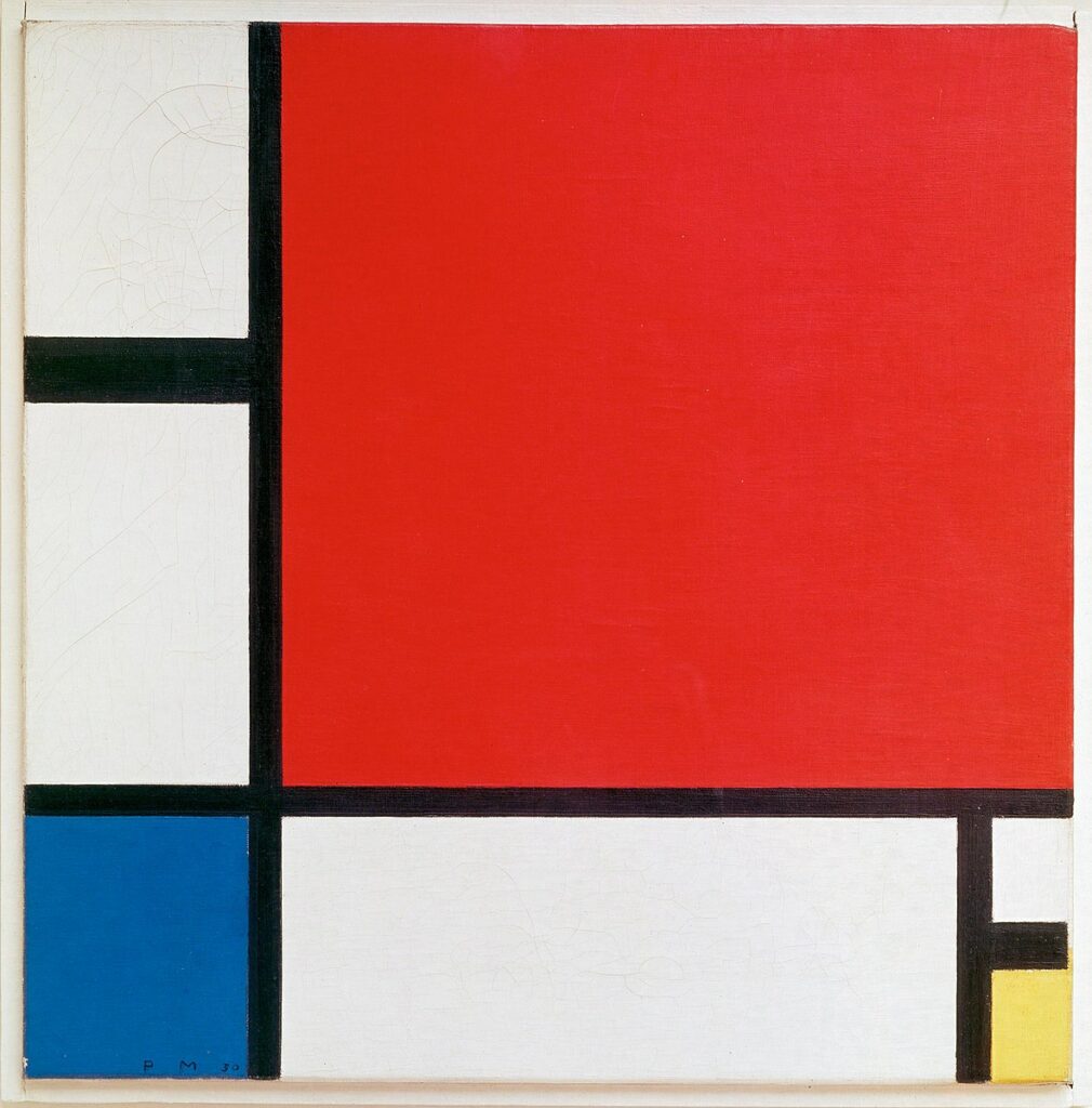
Mondrian’s art used straight, horizontal and vertical black lines on a white background, and rectangles and squares of primary colours (red, yellow and blue).
He always mixed his own colours of paint, never just using the paint straight from the tube, and he never used a ruler to measure out his lines.
He was careful about the composition of his paintings. Composition means the arrangement of shapes and images an artist chooses. Mondrian thought carefully about where to place the lines and colour blocks in his paintings, often placing the colour blocks at the edges, not at the centre, of his work.
Famous art using primary colors
Take a look at these examples of Piet Mondrian’s art. As you look at them, answer these questions:
:: What can you see?
:: What shapes can you see?
:: What colours can you see?
:: What does the painting make you think of?
No. VI / Composition No.II, 1920
Composition II in Red, Blue, and Yellow, 1930
Composition B (No.II) with Red, 1935
Composition with Yellow, Blue and Red, 1937–42
What are primary colors?
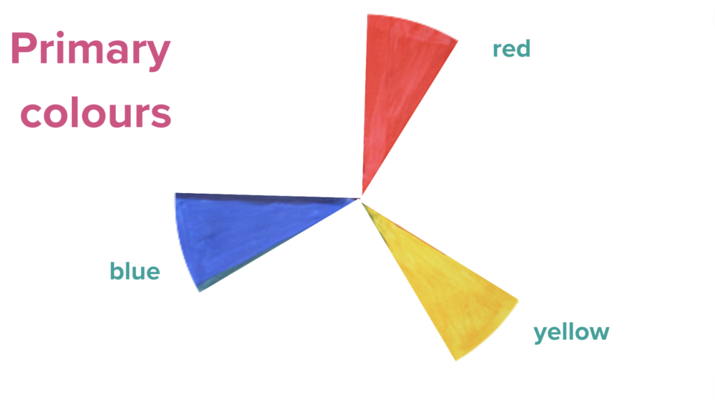
The first combination of colors we are going to work with in our color theory curriculum is the set of primary colors. The word primary means the most important, the first or the beginning.
The three primary colors are red, yellow and blue. You’ll see that they sit equal distance apart from each other on the color wheel.
You might think of them as the original colors, because they can’t be made by mixing any other colors together. All other colors can be made by mixing combinations of red, yellow and/or blue. For example, to make green you can mix yellow and blue together, but you can’t make yellow or blue by mixing any other colors together.
Mondrian often used the primary colors of red, blue and yellow in his art. Other artists use them too, as an artistic challenge in their painting or to make a strong contrast so their colors look vibrant. Here are two more famous paintings that feature primary colors:

The first is called Bedroom in Arles and was painted by Vincent Van Gogh.
Where has he used the primary colors of red, yellow and blue?
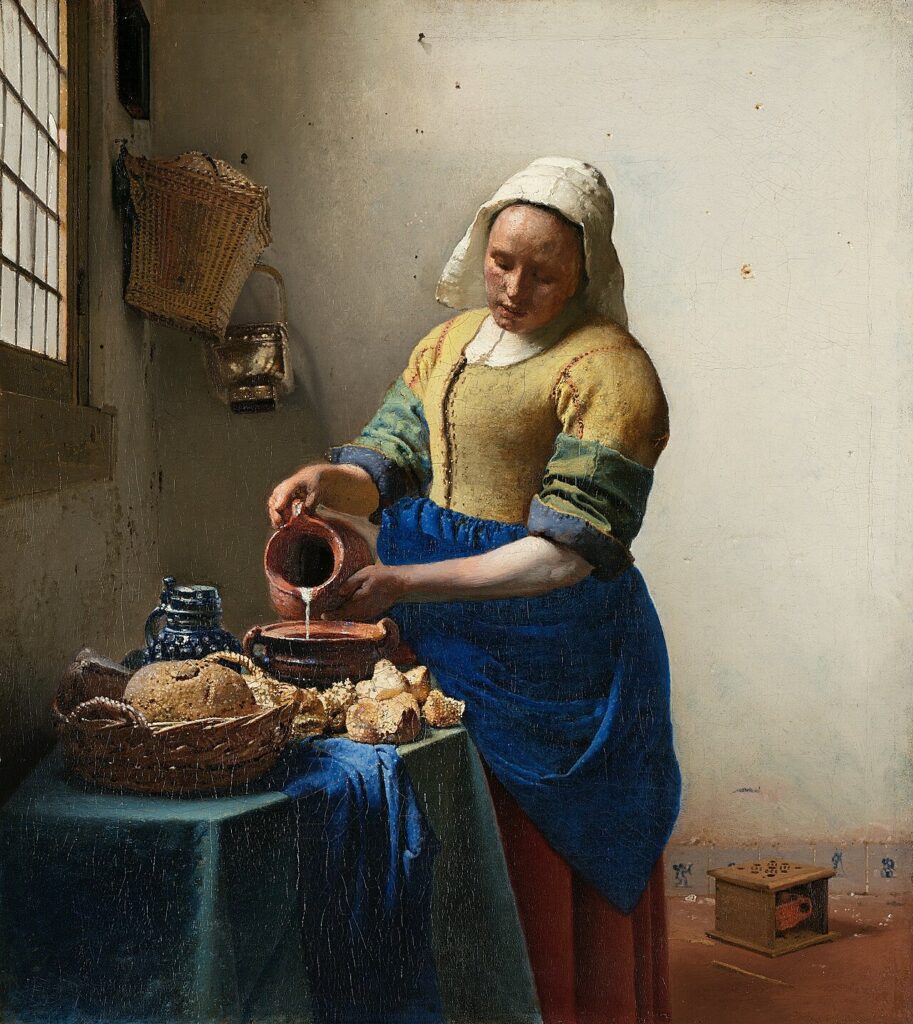
The second is called The Milkmaid and was painted by Johannes Vermeer.
Can you see where he has used primary colors?

In the public domain
STEM and STEAM
Have you heard of the word STEM? It stands for Science, Technology, Engineering and Math. Some people study STEM subjects or work in STEM jobs.
What about the word STEAM? These subject and jobs include that important element of Art, so the work means Science, Technology, Engineering, Art, and Math. It’s very important to add art into the mix with the other subjects. It makes our learning and our work more interesting, more welcoming and more successful. Just as scientists and artists think about color in different, we can learn more, become better at our jobs and think up exciting new ideas when we think about all the subjects from other another perspective.
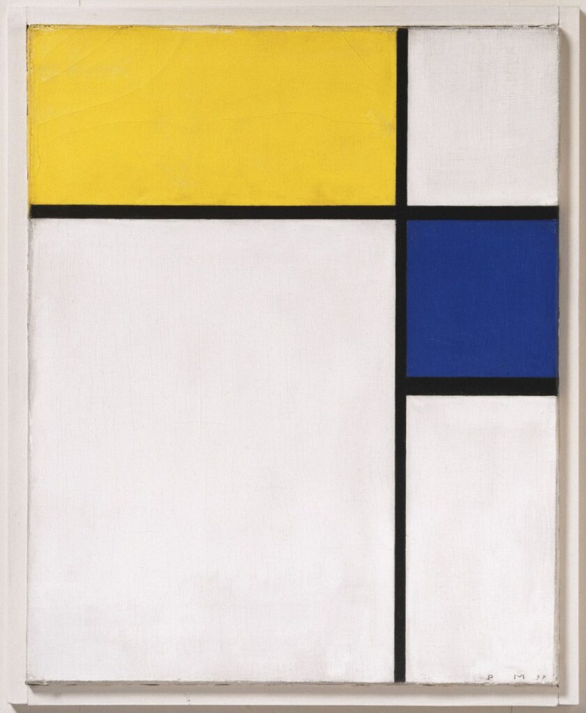
Mondrian’s paintings are great examples to look at to explore the links between art and math.
In the public domain.jpg
Looking at art through math
Look again at the examples of Mondrian’s work linked to above and think about them as a mathematician. How can you use math vocabulary and ideas you have learned about in math lessons to describe the art?
Notice the shapes he uses: all squares and rectangles
Notice the arrangement of parallel and perpendicular lines
Notice the angles he uses: all 90°
You might like to create a piece of mathematical art too. You’ll find some ideas you could try out below.
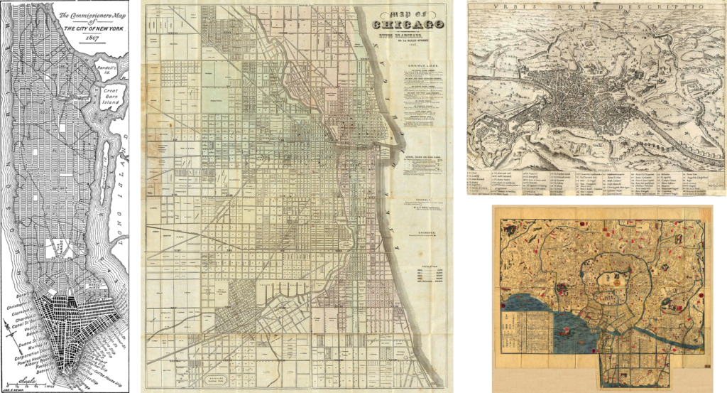
1857 Map of Chicago, Rufus Blanchard – In the Public Domain
Cartaro, Mario: Urbis Romae descriptio; Kupferstich, 1575, Universitätsbibliothek Salzburg, In the Public Domain
Map of Edo around 1840’s, University of Texas Libraries – In the Public Domain
Street maps and blocks
What did Mondrian’s paintings make you think of? I think they look like city maps with the black lines the city streets, laid out in a grid of blocks. Did you know that many cities around the world are laid out in a grid design? The grid is designed by the city planners and architects building the city.
Take a look at these maps of New York and Chicago in the United States of America.
Compare this to older maps of ancient Rome in Italy and Edo (now called Tokyo) in Japan.
:: How are these city layouts different?
:: Why do you think so many cities now use a grid and block layout?
Even Minecraft uses blocks!
Cities that have been planned and build more recently, rather than cities that have developed over a long period of time, tend to use a grid layout so the blocks of buildings in the spaces between the roads are square or rectangular.
The buildings are arranged so that they face the street, with their entrance doors along the sidewalks / pavements and private courtyards at the rear.
Planning a city in numbered blocks makes it easier to organise the space, making areas for schools, hospitals and parks. And it make it harder to get lost!
Do you think Mondrian’s paintings look like city maps? You might like to look at a map of the place you live and see if it’s arranged like a grid, and you could even use it as an inspiration for your art work, making a Mondrian-style map of your town.
Primary colors art lesson for children
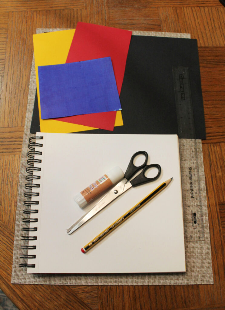
Materials needed:
:: White paper or card
:: Black paper or card (or marker pens / paint)
:: Red, yellow and blue paper or card (or marker pens / paint)
:: Ruler
:: Pencil
:: Scissors or craft knife / cutting board
:: Glue stick

How to make a primary color art project in the style of Piet Mondrian
Our art project inspired by Piet Mondrian will be using the three main motifs of his style:
:: we will create our piece on a white background
:: we will be using straight, black lines that are horizontal and vertical
:: we will be adding geometric blocks of primary colours: red, yellow and blue in rectangle and square shapes
To create collage art inspired by Piet Mondrian you will need a white piece of paper or card.
You might like to draw out a grid of lines in pencil (which you can erase later if you want) or use a sheet of grid paper, to make it easier to align your design.
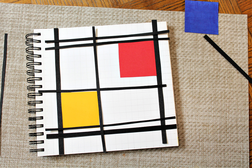
Begin by laying out a grid of black lines on your white paper.
Take some time to play around with the arrangement of black lines, thinking carefully about the composition of your art, like Mondrian did.
How many lines do you want to use?
Will you use thick or thin lines?
Where do you want your lines to cross?
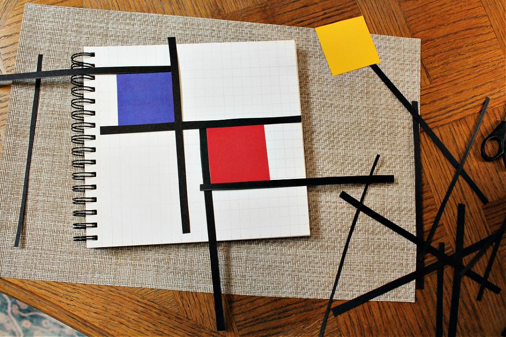
Then add a few blocks of primary-coloured card to your design.
Again, think carefully about where to place to colour blocks.
Do you want to use all three primary colours?
Do you want all your blocks to be the same size?
Will you use squares or rectangles?
Where on your page do you want to place them: in the centre, on one side or at the edge?

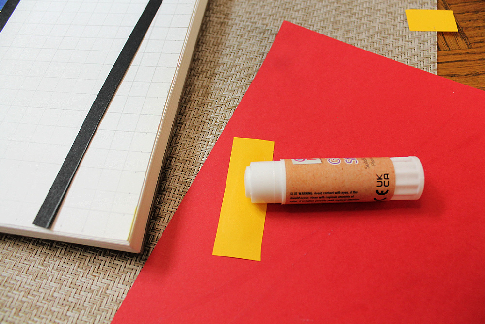
Once you are happy with your arrangement of black lines and colour blocks, stick them in place with glue. Glue sticks are a mess-free option here.
Variations and differentiations
To make this easier for your children you might like to prepare pre-cut black lines and primary colored paper shapes. To make it more challenging, have them cut their own using scissors or a craft knife (using a ruler and cutting board).
Alternatively, you might prefer to work with marker pens or even paint to draw your lines and color blocks.
As a variation, you might use black strips and primary-colored rectangles and squares of cellophane on a light table or over-head projector.

To incorporate math in this project you could:
:: draw a grid or work on grid paper
:: calculate the area and perimeter of the color blocks
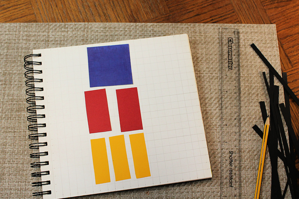
:: work with fractions by starting with three equal size squares (for example, 6cm in length and width) of red, blue and yellow paper.
Cut one into halves (3cm x 6cm).
Cut one into thirds. (2cm x 6cm)
Cut one into quarters (3cm x 3cm).
Notice which shapes are still squares and which are rectangles.
Which fraction is bigger?
Compare equivalent fractions: how two quarters are the same area as one half.
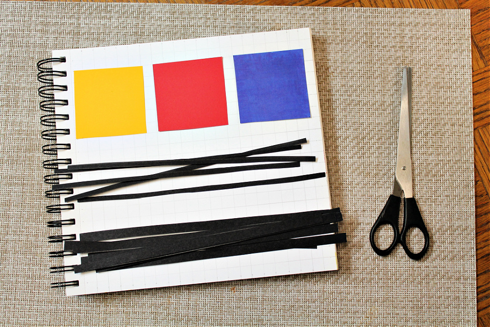
:: set a math challenge for your art. For example, set a challenge to use one of each fraction in your art.
Or set a challenge to use multiples of three: using all three primary colours, three sizes of fractions, three thick lines, 6 thin lines.
Use primary coloured blocks to total a certain area or perimeter.
You could set the challenge for your children or have them think of their own math challenge to apply to their art.

Get all our Color Theory art lesson plans
Use our ready-made Color Theory Art Lesson Plans to explore the color wheel with creative art projects. Our Color Theory curriculum gives you all the resources you need to learn about the color wheel and color theory and enjoy easy and fun art projects for every lesson.
The kit includes art history guides, famous artist profiles, and wider cross-curricular lessons in science, math, language arts and world culture, plus bonus printables and posters to make your teaching even easier.
See more details of our Color Theory curriculum and get your copy here.


