

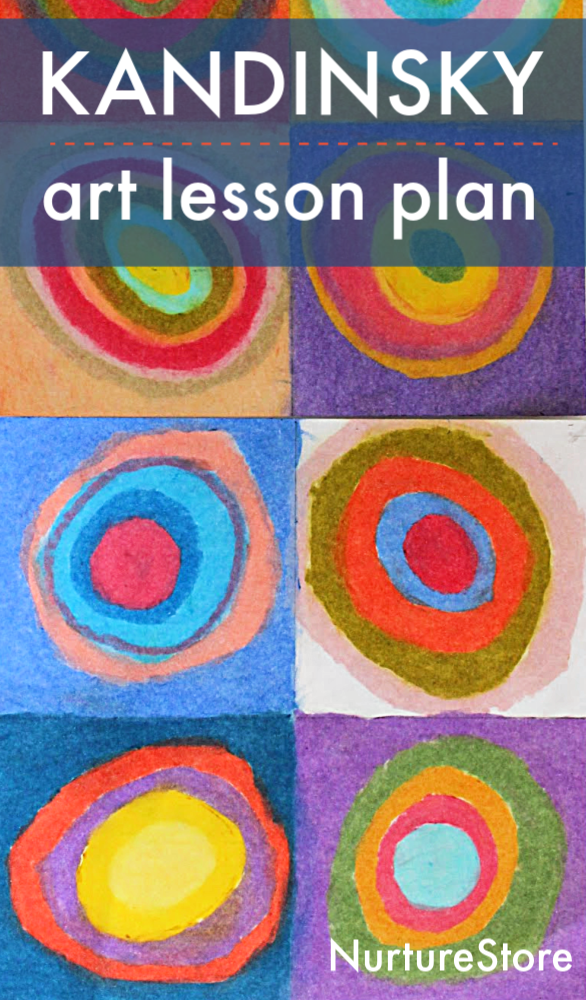
Let’s learn about the famous artist Wassily Kandinsky and make our own version of his famous Kandinsky circles picture, exploring colour theory and oil pastels.
Save time with our ready-made art lesson plans
The best and easiest way to teach great art lessons is to use our ready-made art curriculum, Exploring Great Artists.
This ready-made art curriculum gives you everything you need to teach an exciting art program inspired by the great artists of the world including:
- a complete program of art lessons featuring famous artists from around the world including Miro, Picasso, O’Keefe, Van Gogh, Matisse, Pollock, Monet, Warhol, Mondrian, Kandinsky and many more
- an art history profile of each artist
- creative, hands-on art projects for your children to try, for every featured artist
- materials lists and step-by-step lesson plans that make it so easy to teach
- full colour photographs of real student art work for each project
- everything planned for you, so you can enjoy it as much as your children do
See more and get your copy of Exploring Great Artisits here and you’ll be all set to teach this great curriculum.
Kandinsky circles art lesson for children
In this lesson you will:
:: learn about the famous artist Wassily Kandinsky
:: work with oil pastels to create a work of art inspired by Kandisnsky’s Concentric Circles
:: learn about the colour wheel and experiment with complementary colours
This lesson is part of our famous artist lessons in our Children’s Art Lessons library.
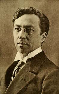
Famous artist in focus :: Wassily Kandinsky
Wassily Kandinsky was born in Moscow, Russia on 16th December 1866. He died on 13th December 1944, at the age of 77.
He was a painter and a pioneer of abstract art (along with Hilma af Klint). He is known for his inventive use of colour, and for his representations of music through art.
Kandinsky had a condition called synesthesia which allowed him to hear colours. Can you imagine what that is like? Perhaps you hear / see in the same way?
Kandinsky’s paintings
Kandinsky is famous for his use of colour, using it to express emotions and scenes in a new way of looking at the world.
Click through on the following links to see examples of this.
As you look at the artworks, answer these questions:
- What can you see?
- What words would you use to describe the artwork?
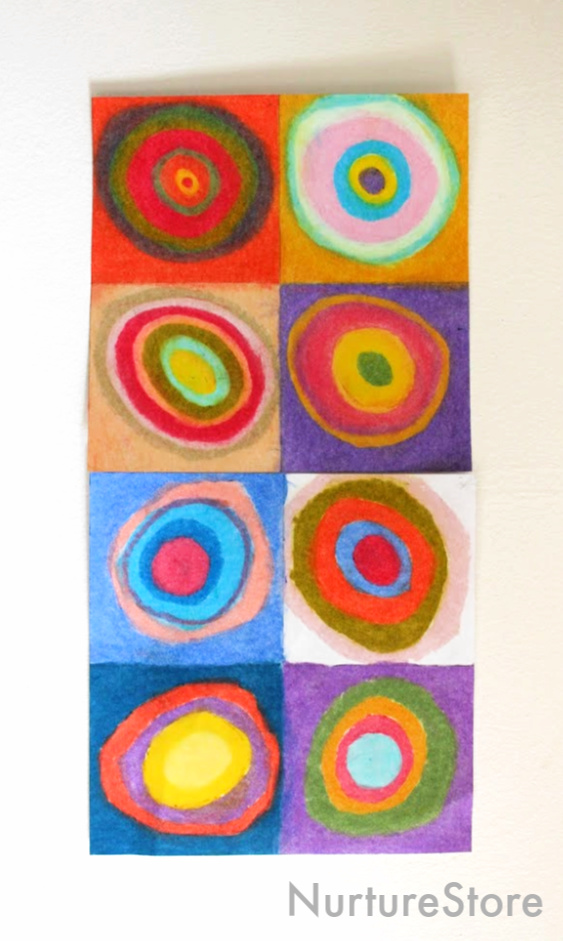
ART PROJECT :: KANDINSKY CIRCLES
One of Kandinsky’s most well-know images is not a painting intended to be displayed as an art work, but rather a set of images he used as a colour study, trying out combinations of colours together.
Click here to see this image, which we will use as the inspiration for our own art inspired by Kandinsky circles: Colour Study, Squares with Concentric Circles, 1913
Materials needed
:: paper or card
:: oil pastels
:: ruler
:: pencil
:: tissues or paper towels
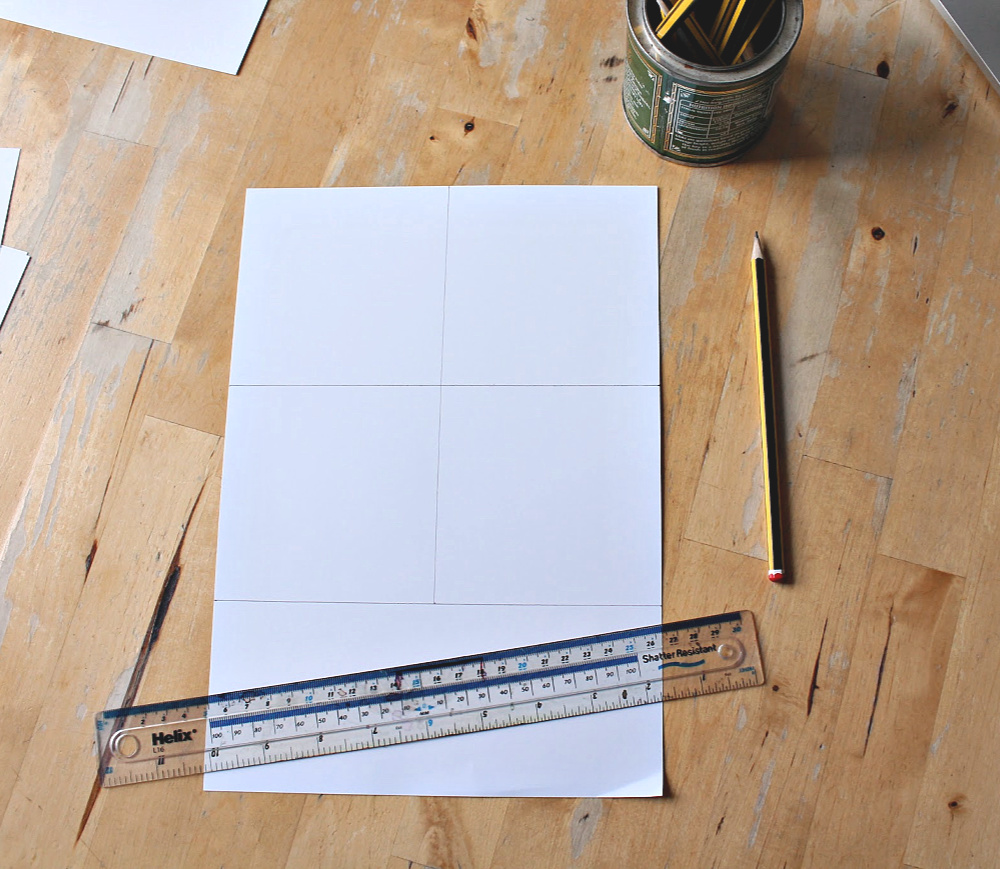
Begin by using a pencil and ruler to divide your paper or card in squares.
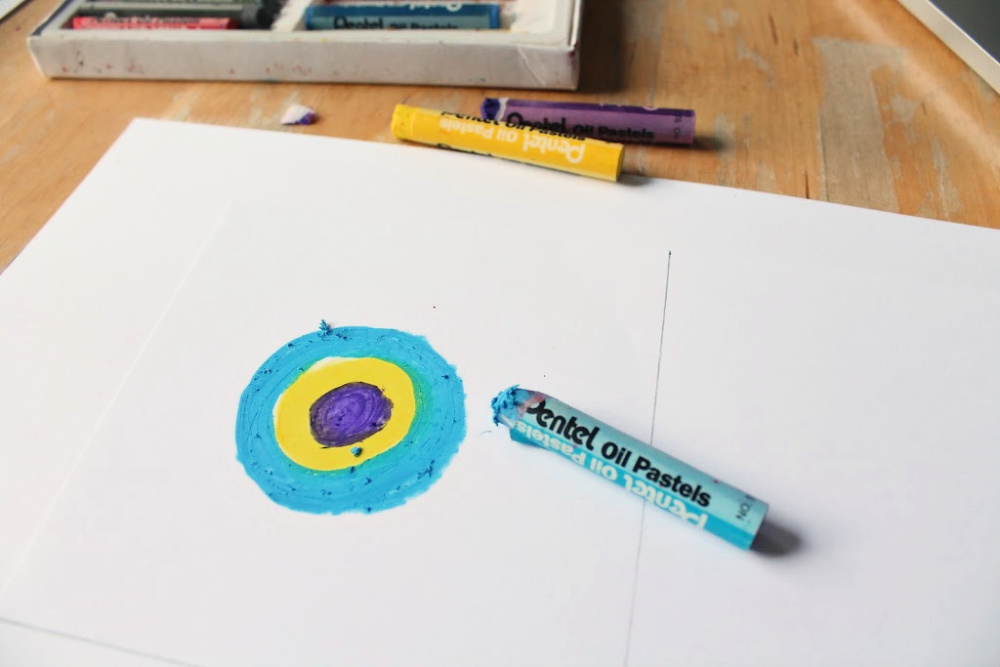
We will use oil pastels for our colour study. Oil pastels have a smooth, sensory feel to them as you apply them to a surface, and blend together well.
Try one out by using it to draw a circle in the centre of one of your square spaces.
Use other colours of oil pastels to build up your circle, adding bigger circles of colour around your first circle, until you have filled your square space with colourful concentric circles.
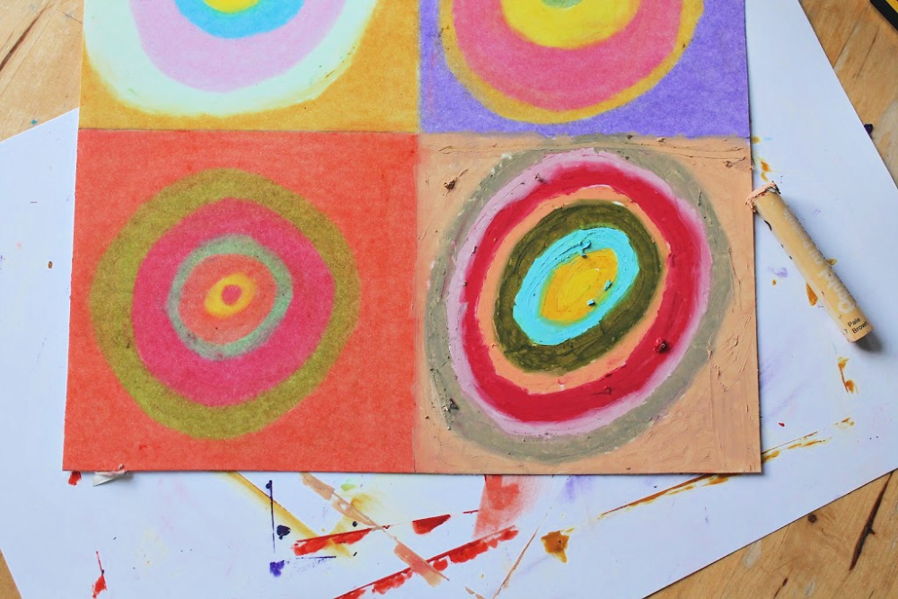
Oil pastels blend together well and we can also change the appearance of the pastels considerably by rubbing over the surface of the pastels on our page.
You’ll see from the image above how the oil pastels leave a textured surface on the paper at first application.
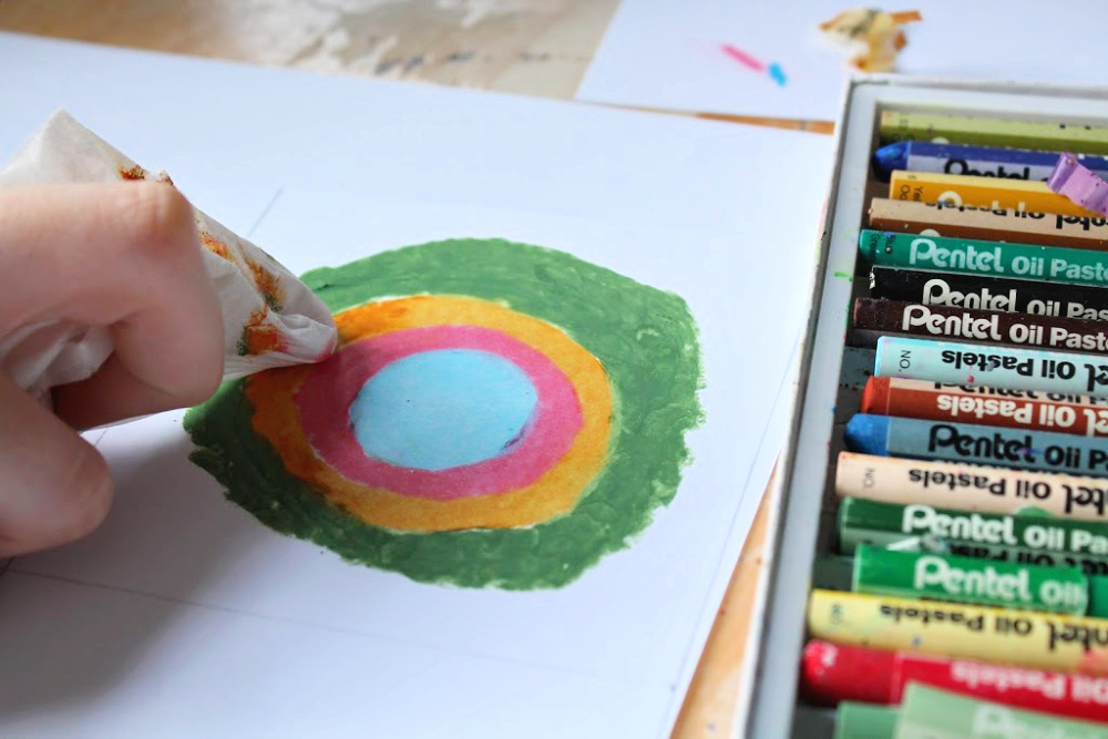
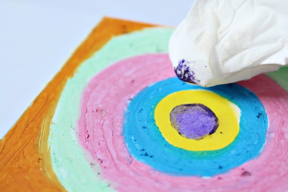
Experiment by taking a tissue or paper towel and using it to rub over the oil pastel on your paper.
Rub around each circle of colour in turn, following each colour’s ring – rather than rubbing over all the rings at the same time – so you don’t blur your colours together.
As you rub you are removing the top layer of the oil pastel onto your tissue.
You can see in the images above and below the difference created by rubbing the oil pastels with a tissue/paper towel.
What words would you use to describe the ‘before’ picture above, and the ‘after’ picture below?
Which version do you prefer?
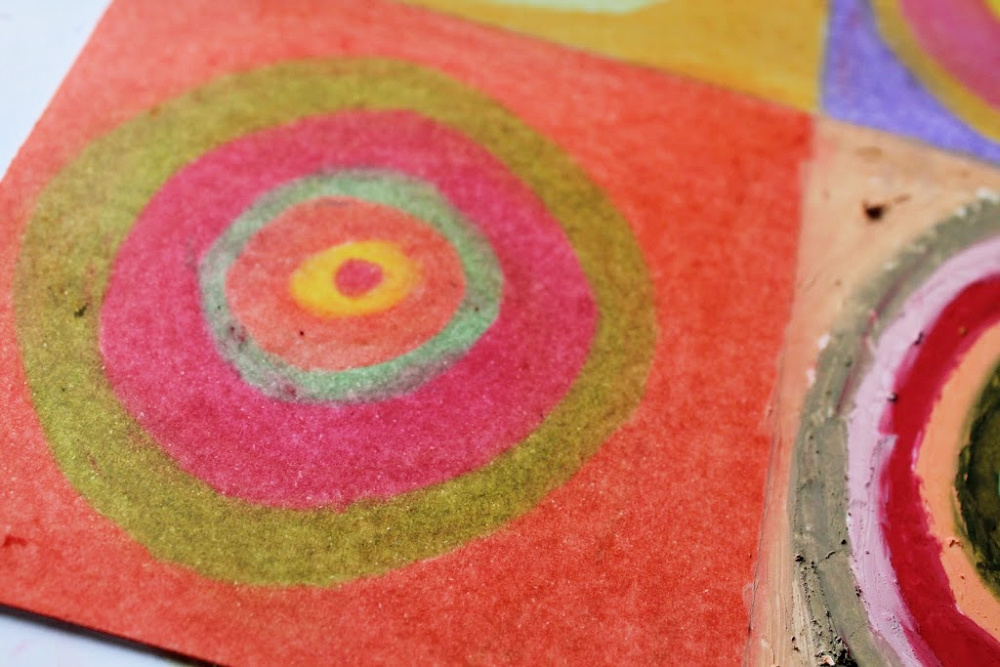
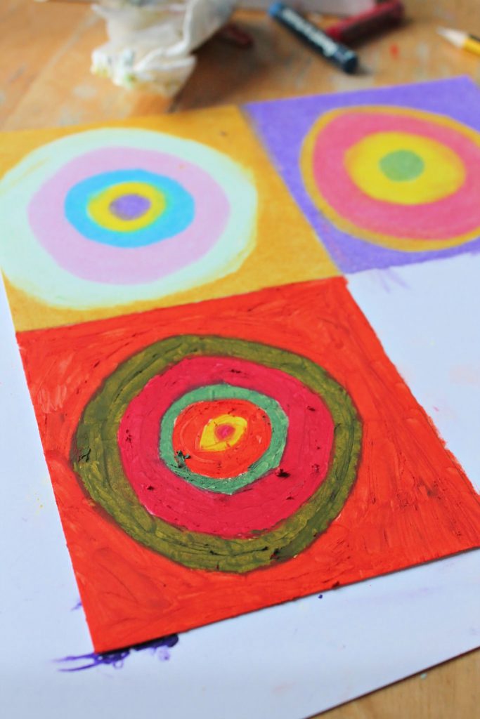
Continue to fill all the squares on your paper with concentric circles of colour.
You can experiment with the colours that you place together, exploring colour theory.

Colour theory
Let’s use the colour wheel to help us choose the colours we use for our circles.
Have you ever noticed that colours can look different depending on which colours they are placed next to? For example, red can look different if it’s used with orange, or if it’s used with green. This is very useful to know if you are an artist. You can create artworks with very different effects and feelings depending on the colours you use and which ones to place near each other. Kandinsky was an expert at using colours in this way.
One very important combination to know about, and one that Kandinsky used in many of his paintings, is complementary colours.
Complementary colours are special pairs of colours that have an outstanding effect on each other. When complementary colours are placed next to each other they have the strongest contrast with each other. They are sometimes referred to as opposite colours, because of the striking colour clash they create.
On the colour wheel there are three primary colours: red, blue and yellow.
If we mix these colours in pairs we get the secondary colours: purple (red mixed with blue), green (blue mixed with yellow), and orange (yellow mixed with red).
Do you know which pairs of colours are complementary pairs? Have a look at the colour wheel above and see if you can work it out.
Start with red and imagine a straight line across the colour wheel – which colour would it touch? Which colour is it opposite? It’s green – so red and green are complementary colours.
Have a look at yellow. What’s its opposite pair? It’s purple – so yellow and purple are complementary colours.
And finally, what colour is opposite blue? It’s orange – making blue and orange a complementary pair.
Have a look again at Kandinsky’s Colour Study, Squares with Concentric Circles and see if you can spot the places where he places primary colours together. Where does he use secondary colours together? Where does he use complementary colours together?
Which of his colour combinations do you like best?
Can you use these ideas of colour theory to colour the remaining squares on your page?
You might make one set of concentric circles all primary colours. Make a another set all of secondary colours. And use complemetary colours to make your other sets.
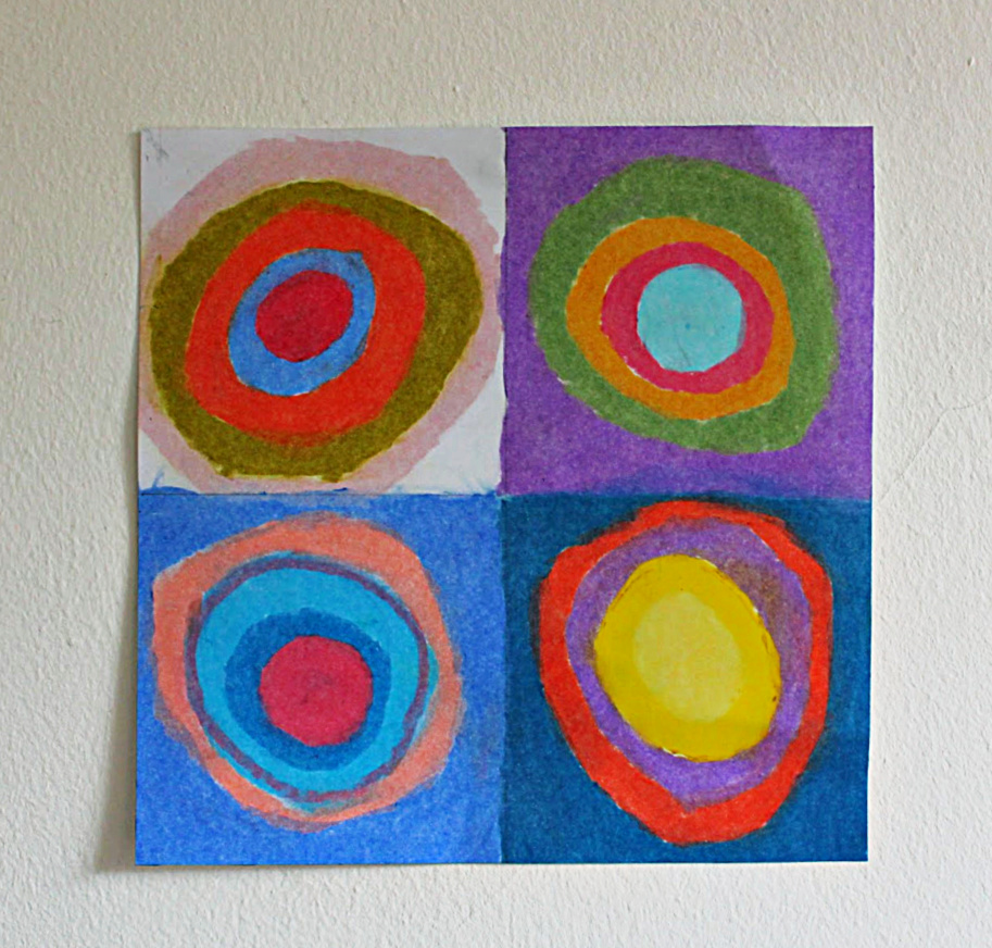
Play about with the oil pastel colours, just like Kandinsky did, to make your own colour study.
Which combination of colours do you like the best?
Or explore the work of Keith Haring, an artist who also uses simple stick-figure style people in his art, but in a colourful way that is a contrast to the art of Giacometti.
Save time with our ready-made art lesson plans
The best and easiest way to teach great art lessons is to use our ready-made art curriculum, Exploring Great Artists.
This ready-made art curriculum gives you everything you need to teach an exciting art program inspired by the great artists of the world including:
- a complete program of art lessons featuring famous artists from around the world including Miro, Picasso, O’Keefe, Van Gogh, Matisse, Pollock, Monet, Warhol, Mondrian, Kandinsky and many more
- an art history profile of each artist
- creative, hands-on art projects for your children to try, for every featured artist
- materials lists and step-by-step lesson plans that make it so easy to teach
- full colour photographs of real student art work for each project
- everything planned for you, so you can enjoy it as much as your children do
See more and get your copy of Exploring Great Artisits here and you’ll be all set to teach this great curriculum.
Love this lesson on Kandinsky! Perfect for my kids to do and learn from. Thank you!!!
So glad you all enjoyed it Tina!