

In this easy color theory lesson children can learn about the color wheel, mix their own colors, and go on a color hunt through examples of famous art.

Save time with our ready-made art lesson plans
The best and easiest way to teach great art lessons is to use our ready-made art curriculum, Color Theory.
This ready-made art curriculum gives you everything you need to teach a hands-on art program about the color wheel including:
- a complete program of art lessons about the color wheel to learn about primary colors, secondary colors, tertiary colors, warm and cool colors, monochome, and tints, tones and shades
- creative, hands-on art projects for your children to try, for every featured artist
- art history guides and famous artist profiles of all the featured artists: Piet Mondrian, Georges Seurat, Wassily Kandinsky, James McNeill Whistler
- examples of famous art to illustrate each color theory concept
- wider cross-curricular lessons including the science of light and color, how the eye works, rainbows, maps, photography and film history, how colors get their names and color recipe codes
- materials lists and step-by-step lesson plans that make it so easy to teach
- full colour photographs of real student art work for each project
- bonus printables include: Color Wheel Posters, Color Groups Chart, and templates and guides for individual art projects
- everything planned for you, so you can enjoy it as much as your children do
See more and get your copy of Color Theory here and you’ll be all set to teach this great curriculum.
Easy color theory art lesson for children using famous art
In this workshop we’re going to paint our own colour wheel.
You’ll learn how to mix colours, and learn about the different kinds of colours artists can use including primary, secondary, and tertiary colours.
We’ll talk about how we can pair complementary colours together, and explore how the famous artist Henri Matisse used this technique in his art.
This lesson is part of our Children’s Art Lessons library.
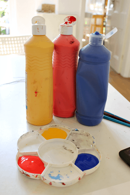
Materials needed
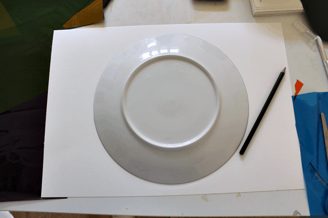
:: paper plate or circle of card
:: ruler
:: pencil
:: red, blue and yellow paints: water based or acrylic
:: protractor (optional)
How to paint a colour wheel
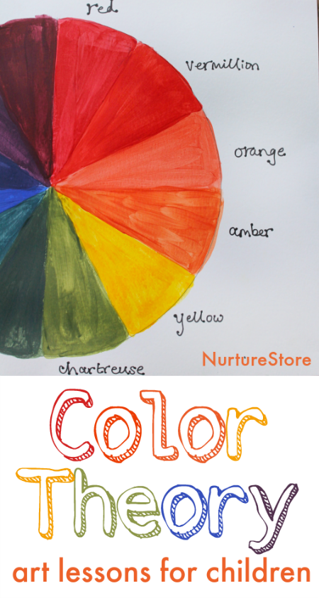
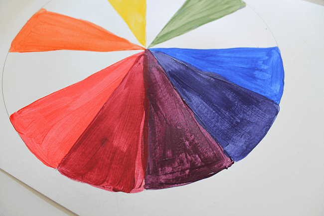
Take your paper plate or circle of card and divide it into twelve sections.
Use your pencil and ruler to first half, then quarter the circle. Then divide each quarter into three, giving you twelve ‘slices’ of circle.
Your lines don’t need to be perfectly spaced – good enough is good enough! Although if you do like to be precise you can use a protractor and measure sectors of 30°.
Primary Colours
We’re going to paint a rainbow of colours on the wheel, starting with the primary colours of red, blue and yellow. We’ll mix all the other colours from these three.
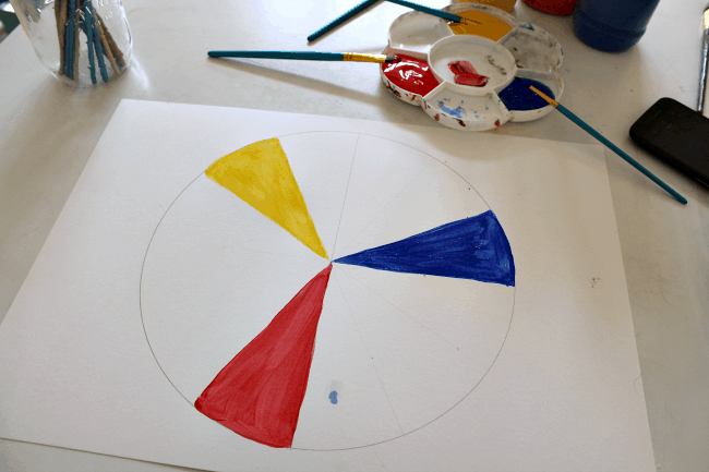
Paint one section of your wheel red.
Count around the wheel three spaces and then paint the fourth section yellow.
Count around the wheel a further three spaces and then paint the fourth section blue.
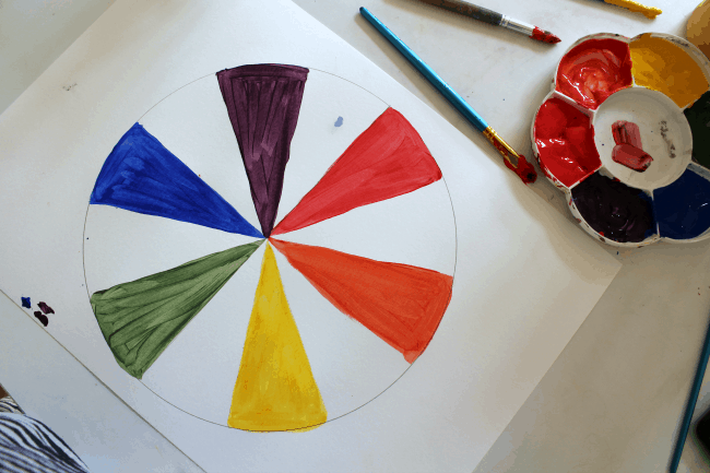
Secondary Colours
Then we’ll make the secondary colours of orange, green and purple.
Mix together equal parts red and yellow to create orange, and paint that in the middle space between your red and yellow sections.
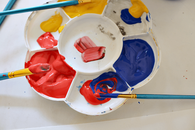
Mix together equal parts yellow and blue to create green, and paint that in the middle space between your blue and yellow sections.
Mix together equal parts red and blue to create purple, and paint that in the middle space between your red and blue sections.
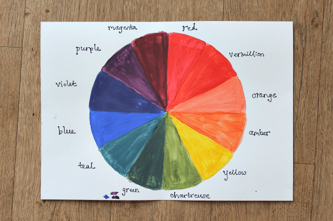
Tertiary Colours
Finally, we’ll complete the colour wheel by mixing tertiary colours, as follows:
red and orange to make vermillion (red-orange)
orange and yellow to make amber (yellow-orange)
yellow and green to make chartreuse (yellow-green)
green and blue to make teal (blue-green)
blue and purple to make violet (blue-purple)
purple and red to make magenta (red-purple)
Which colour is your favourite?
Complementary colours
Have you ever noticed that colours can look different depending on which colours they are placed next to?
For example, red can look different if it’s used with orange, or if it’s used with green.
This is very useful to know if you are an artist. You can create artworks with very different effects and feelings depending on the colours you use and which ones to place near each other.
Henri Matisse was an expert at using colours in this way.
One very important combination to know about, and one that Matisse used in many of his paintings and cut outs, is complementary colours.
Complementary colours are special pairs of colours that have an outstanding effect on each other. When complementary colours are placed next to each other they have the strongest contrast with each other.
They are sometimes referred to as opposite colours, because of the striking colour clash they create.
Do you know which pairs of colours are complementary pairs? Have a look at the colour wheel you have made and see if you can work it out.
Start with red and imagine a straight line across the colour wheel – which colour would it touch?
Which colour is it opposite? It’s green – so red and green are complementary colours.
Have a look at yellow.
What’s its opposite pair? It’s purple – so yellow and purple are complementary colours.
And finally, what colour is opposite blue? It’s orange – making blue and orange a complementary pair.
Art Scavenger Hunt
Let’s use the colour wheel to go on an art scavenger hunt and see how Matisse used complementary colours in is art.
Take a look at these artworks see how many times you can see Matisse pairing complementary colours together.
Interior with a Young Girl (Girl Reading), 1905-06
Plum Blossoms, Ochre Background, 1948
The Snail, 1953
André Derain, 1905
Save time with our ready-made art lesson plans
The best and easiest way to teach great art lessons is to use our ready-made art curriculum, Color Theory.
This ready-made art curriculum gives you everything you need to teach a hands-on art program about the color wheel including:
- a complete program of art lessons about the color wheel to learn about primary colors, secondary colors, tertiary colors, warm and cool colors, monochome, and tints, tones and shades
- creative, hands-on art projects for your children to try, for every featured artist
- art history guides and famous artist profiles of all the featured artists: Piet Mondrian, Georges Seurat, Wassily Kandinsky, James McNeill Whistler
- examples of famous art to illustrate each color theory concept
- wider cross-curricular lessons including the science of light and color, how the eye works, rainbows, maps, photography and film history, how colors get their names and color recipe codes
- materials lists and step-by-step lesson plans that make it so easy to teach
- full colour photographs of real student art work for each project
- bonus printables include: Color Wheel Posters, Color Groups Chart, and templates and guides for individual art projects
- everything planned for you, so you can enjoy it as much as your children do
See more and get your copy of Color Theory here and you’ll be all set to teach this great curriculum.