Use this easy monochrome art lesson to teach your children about tints, tones and shades of color.
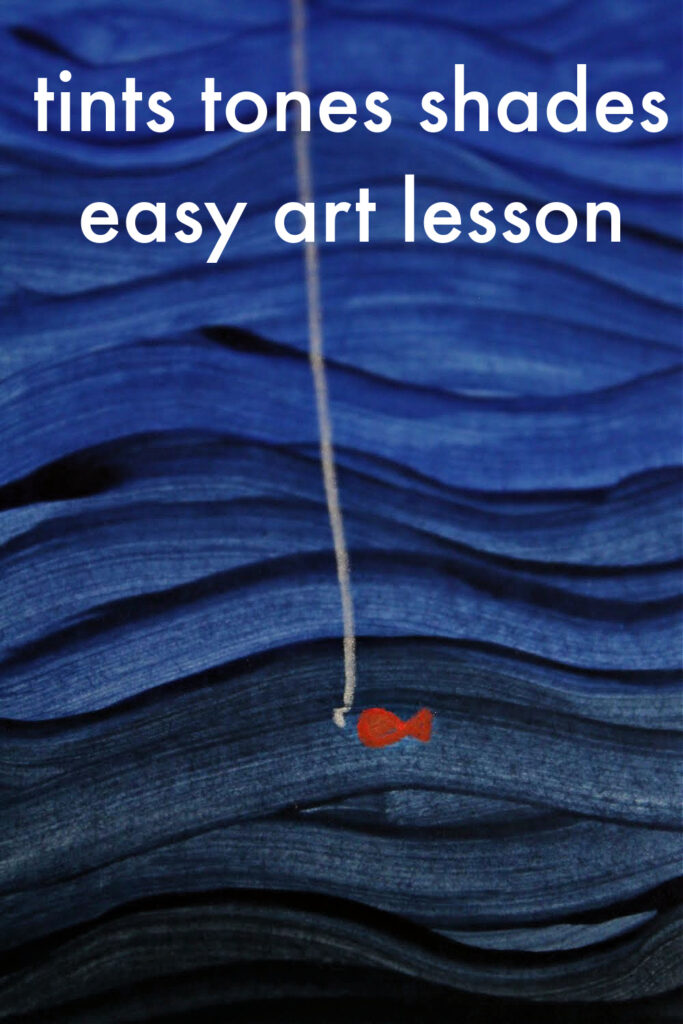
Easy monochrome art lesson to teach tints, tones and shades to children
This monochrome art lesson for children is part of our color theory lessons curriculum within our art lessons and craft activities for children.
In this lesson, you can:
:: learn about the color wheel
:: learn how to mix tints, tones and shades of colors
:: learn about the famous artist James McNeill Whistler and see examples of his work
:: learn about monochrome art
:: think about how colors are named
:: make a piece of art inspired by James McNeill Whistler, mixing your own monochrome tints and shades
:: get more ready-made color theory art lessons to teach your children about the color wheel
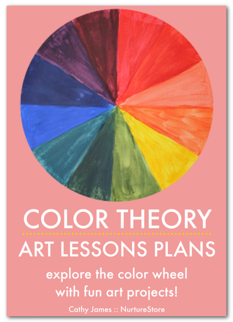
Get all our Color Theory art lesson plans
The best way to teach color theory to your children is to use our ready-made Color Theory Art Lesson Plans. Our Color Theory curriculum gives you all the resources you need to learn about the color wheel and color theory with easy and fun art projects for every lesson.
The kit includes includes art history guides, famous artist profiles, and wider cross-curricular lessons in science, math, language arts and world culture, plus bonus printables and posters to make your teaching even easier.
See more details of our Color Theory curriculum and get your copy here.
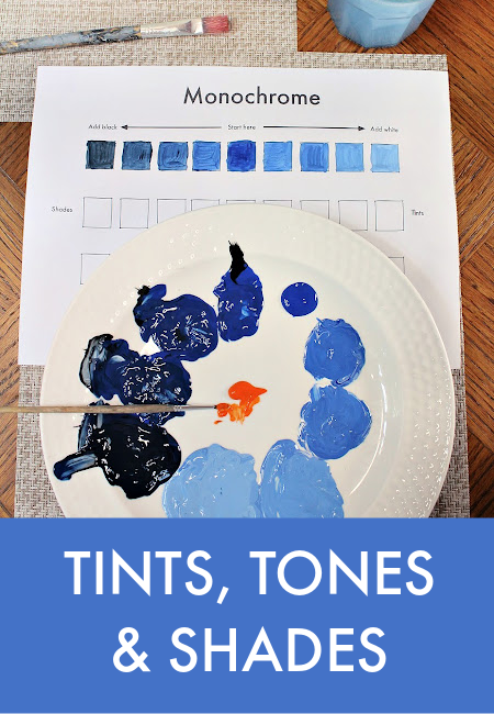
What are tints, tones and shades of color?
To make a wide selection of colors to use in our art, we can take one color from the color wheel and make it lighter or darker. Rather than mixing primary or secondary colors together, as we have done in our other color theory lessons, in this easy monochrome art lesson we’re going to choose one color and mix it with white and with black to create a range of tints and shades.
A tint is a color that has been mixed (lightened) with white.
A shade is a color that has been mixed (darkened) with black.
And a tone is a color that has been mixed (neutralised) with gray.
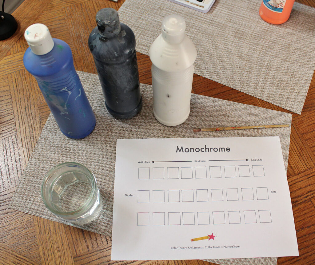
How to mix tints, tones and shades
Materials needed:
:: Monochrome Printable from our Color Theory Art Lessons kit
:: One color of paint chosen from the color wheel
:: White paint
:: Black paint
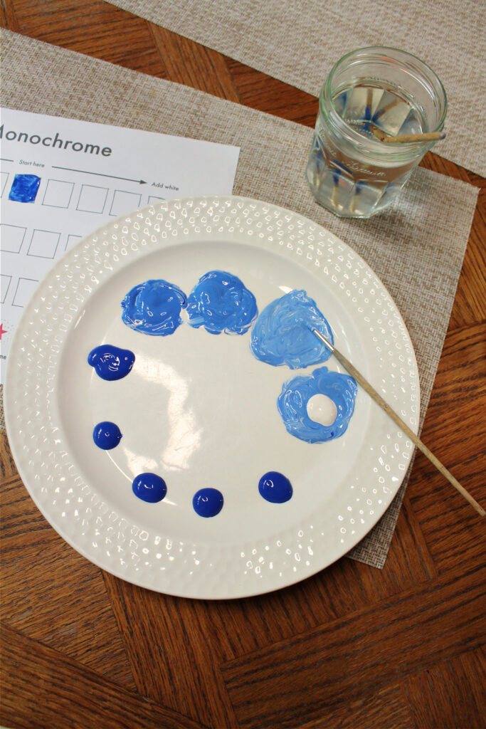
First, choose a color from the color wheel that you want to work with. It can be a primary color (red, blue or yellow) or a secondary color (purple, green or orange). We will also use this color to make our artwork in this lesson so choose a color that you would like to use for your later painting.
Make 9 blobs of this color on a plate or paint palette. We’ll use these color blobs to mix our tints and shades, and also to make our later artwork, so keep all the blobs separate throughout our color mixing experiment, so you have a range of tints and shades to work with later.
Starting in the centre of the row on the Color Theory Art Lessons printable, fill in one square with your pure color.
How to mix tints with paint
Next, mix your pure color with increasing amounts of white and fill in the four squares to the right of your pure color: Start by adding only a tiny bit of white to another of your blobs of pure color and using this mix to fill in the square that is right next to your pure color.
Then, working with the next blob of pure color, add just a little more white than last time and fill in the next square along the row to the right.
On to the next blob of pure color, add a little more white this time and fill in the next square on the printable.
Finally add even more white to another blob of pure color and fill in the final square, at the far right. You have made a row of tints.
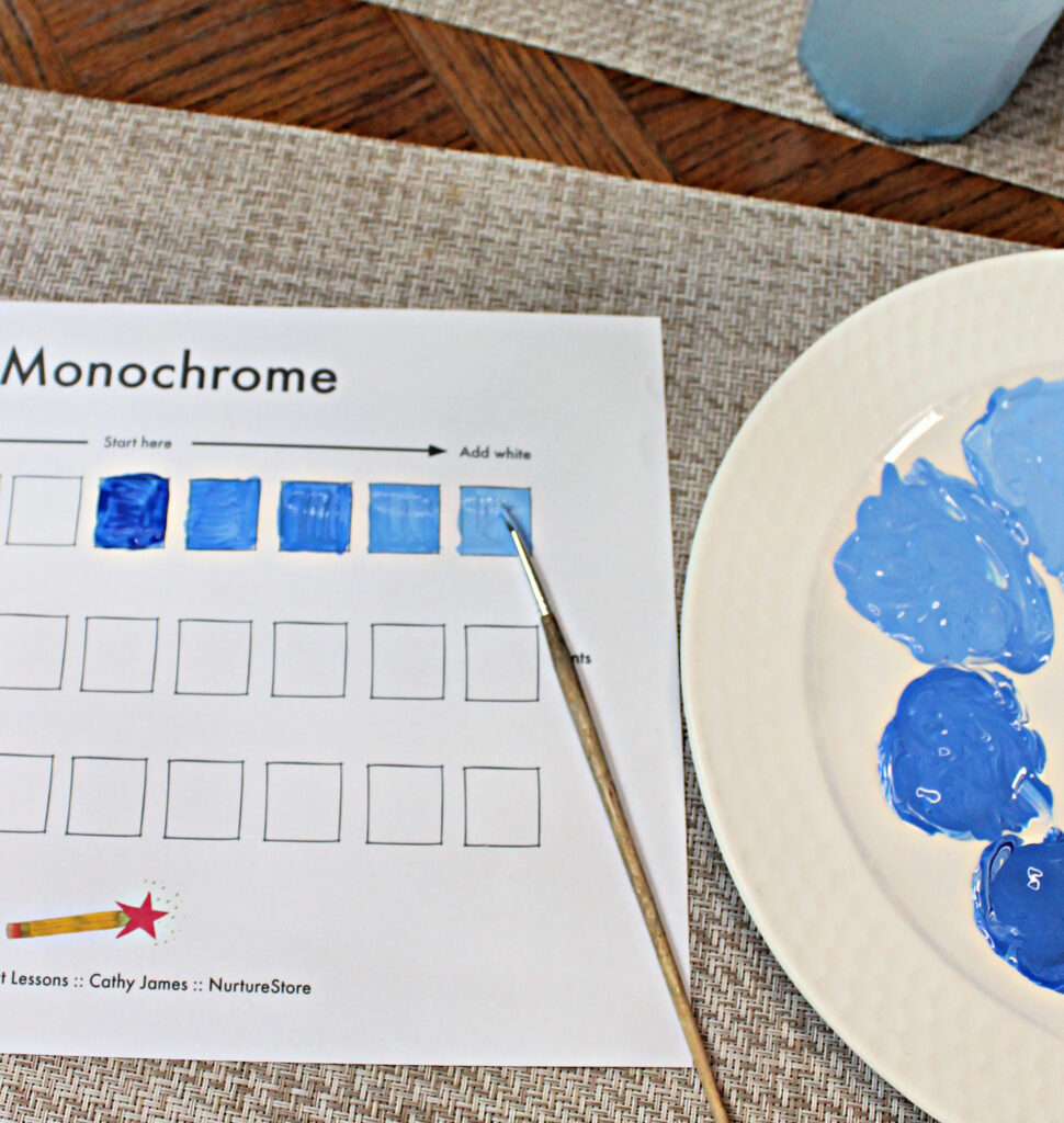
How to mix shades with paint
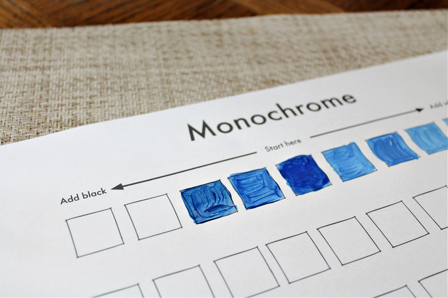
Then, mix the remaining blobs of pure color with increasing amounts of black and fill in the four squares to the left of your pure color. Adding back can have a stronger effect than adding white, so begin with adding just a tiny bit of black to one of your remaining blobs of pure color. Fill in the square next to your pure color.
Next add just a little more black to another blob of pure color and fill in the next square along the row to the left. Add a just little more black to another blob of pure color and fill in the next square.
Finally add more black to the last blob of pure color and fill in the final square, at the far left. You have made a row of shades.
You now have a palette of tints and shades in your chosen pure primary or secondary color which you can use to make a picture. How would you describe all the colors in your palette?
How do colors get their names?
We need to name individual colors so we can talk about them with other people. We need to be able to communicate with others in a way that gets us what we want. If I ask for some buttercup yellow paint to decorate the walls of my house or some robin egg blue fabric to make a shirt, it’s important that the decorator or shop assistant giving me the paint or the fabric understands what color I want.
Do you know how colors get their names?
Some colors are named for things that are the same color in nature, such as olive green and lime green.
Some colors are named for things that are usually the same color, such as post box red, which is the same color as all the traditional post boxes in the United Kingdom.
How do you think Licorice Black is different from Midnight Blue Black?
What about Cornflower Blue and Periwinkle Blue?
And what about Amber Orange and Gold Orange?
The more names you know for individual colors, the better you can identify the differences, and this might even help you to see more colors.

Color recipe codes
To accurately communicate which individual colors we want, for example when we want a particular color to be printed or displayed on a website, we can give the ‘recipe’ for the individual color. Computers can use numbers as a kind of recipe to track how much of certain color has been mixed together to make the color that is wanted. The computer can record this in different codes which include HEX codes, RGB codes and CMYK codes. RGB codes say how much red (R), green (G) and blue (B) is in a color. For example Barbie Pink has the RGB code 224, 33, 138 which means it is made from an intensity of red of 224, an intensity or green of 33 and an intensity of blue of 138.
Make up names for each of the tints and shades you have made. You could name them for the food, flowers, or things they are like, or name them after the feeling or mood they remind you of. There are no right or wrong names here, so have fun and be as imaginative as you like in choosing your names. You might like to write the names you have made up on your Monochrome Worksheet above each square.
You can see a range of colors and their names here.
What is monochrome art?
Mono means one and chrome means color, so monochrome art is art that is created using just one color.
Why do you think artists often choose to make monochrome art, using tints, tones and shades of one color? Some use monochrome to make the painting very simple in color, so that the focus of the art is on the shapes, texture or the way the art was made. Some use it to emphasise the light and dark in a picture. Some use it to create a tranquil effect.
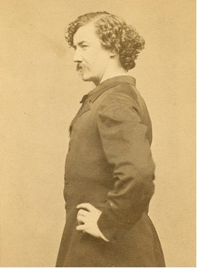
Meet famous artist James McNeill Whistler
Let’s look at the work of an artist who is famous for using monochromatic tints, tones and shades.
James McNeill Whistler was an American painter and printmaker. He was born in Lowell, Massachusetts in 1834 and died in London, England in 1903.
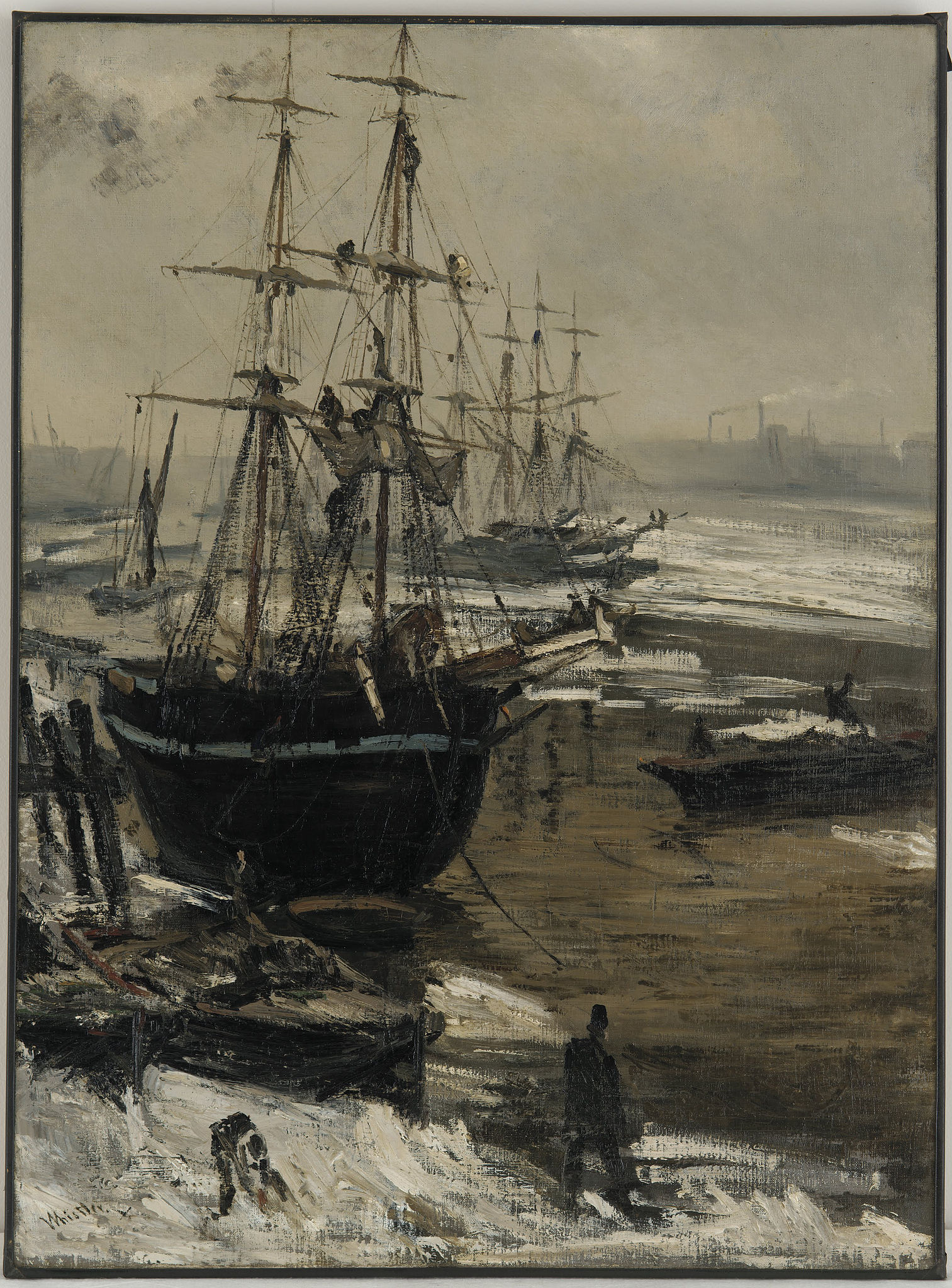
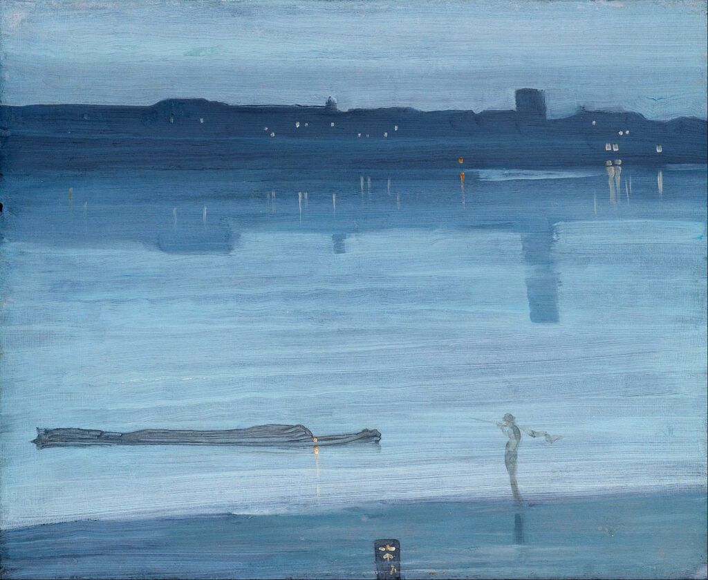
He was interested in the links between music and painting. Many of his paintings are named ‘arrangements’, ‘harmonies’ and ‘nocturnes’ and focus on the harmony of color, as he used a color palette of tints, tones and shades.
Take a look at these examples of James McNeill Whistler’s art. As you look at them, answer these questions:
:: What can you see?
:: What colors can you see?
Nocturne: Blue and Silver – Chelsea, 1871
Arrangement in Grey and Black No. 1 / Whistler’s Mother, 1871
Nocturne: Blue and Gold – Southampton Water, 1872
Nocturne: Blue and Gold – Old Battersea Bridge, circa 1872 – 1875
Green and Silver: Beaulieu, Touraine, 1888
Discussion questions
:: Do you think it is easier or harder to create art if you are only using one color?
:: Do you think you can create detailed and expressive art if you are only using one color?
:: How do you create this interest, mood and expression if you are only using one color?
Monochrome art often draws attention to where the light is in the painting. This light may be coming from the sun, the moon, a candle or through a window. Areas where the light falls are painted in lighter tints. Areas where the light doesn’t reach and are in shadow are painted in darker shades.
Look again at the examples of Whistler’s paintings and see if you can work out where the light is coming from in the picture. Can you see where Whistler has used tints and where he has used shades?
Make a James McNeill Whistler-inspired monochrome art project
Let’s make our own monochrome art project inspired by James McNeill Whistler, using our color palette of tints and shades.
Our monochrome art project inspired by Whistler will be using two key elements:
:: we will color our picture using monochrome tints and shades
:: we will consider where the light and shade is and use our colors to show this
You might have noticed that many of Whistler’s painting had the word ‘nocturne’ in their titles. In art, ‘nocturne’ means a picture of a night scene. In music, ‘nocturne’ means a short, romantic piece of music, usually played on the piano. You might like to listen to some nocturn music, for example by the Polish composer Frédéric Chopin, while you paint.
Materials needed
Materials needed:
:: Sheet of white paper or card
:: The pure color, tints and shades you have mixed
:: Optional: white pen or pencil, black pen or pencil, one other color of paint or pen
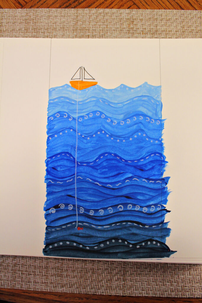
Decide what monochrome picture you want to create with your color palette. You can follow the example that follows, using tints and shades of blue to create an ocean picture inspired by Whistler’s river and sea paintings, or choose your own subject. For example:
:: With tints and shades of red you might make a sunset or volcano.
:: With tints and shades of yellow you might make a sunflower.
:: With tints and shades of green you might make a forest.
:: With tints and shades of orange you might make a pumpkin or a ginger cat.
:: With tints and shades of purple you might make flowers such as pansies and lavender.
You could also paint something that isn’t usually made from your chosen color – perhaps even a self-portrait.
Whatever you decide, think about where the light is in your picture and paint those areas using lighter tints, and paint the areas with little or no light using your darker shades.
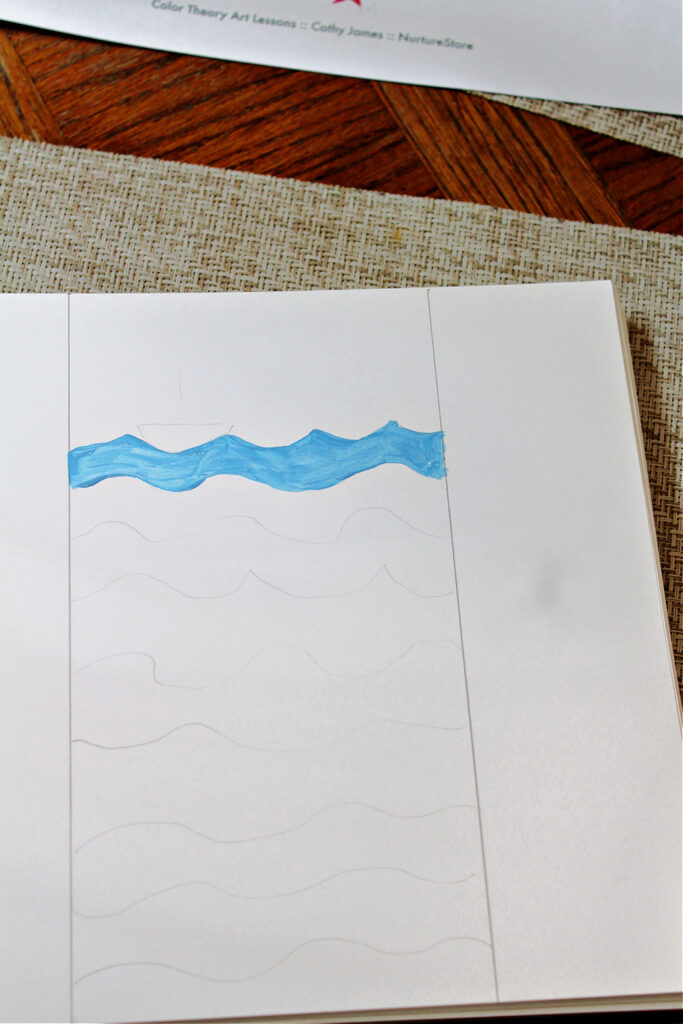
How to make a monochrome ocean painting using tints and shades
To make a deep sea picture:
Use a pencil to draw layers of waves.
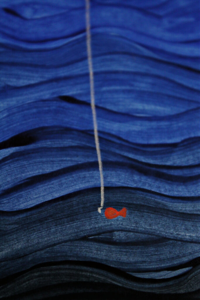
Use a different tint or shade to paint each layer. The light in this picture would be coming from the sun in the sky above. This means there would be more light in the top layers of the waves, called the sunlight zone, and less light down at the bottom of the sea, in what is called the midnight zone; so layer your tints and tones from light to dark, top to bottom in your waves.
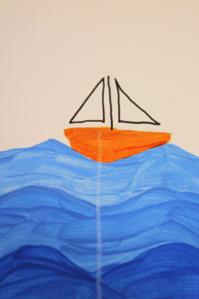
Adding details
Add a boat, floating on the top of the sea. You might use a pencil or pen to draw its outline and then use paint to fill in the hull and sails. You might like to use a different color from the color wheel to add a ‘pop’ or color, just like Whistler did in some of the paintings we looked at. Choose a color from the color wheel using one of the color theory rules we’re learning about in our Color Theory Lesson Plans: either a primary color, a secondary color, a contrasting color to the blue, a warm color to contrast the blue, or a cool color to match the blue. Whichever color you use, see if you can name which part of the color wheel it is from.
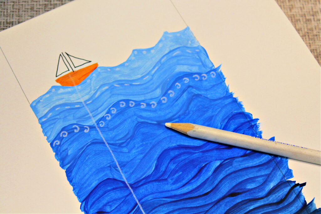
Once the paint is dry you might also like to add texture by using a white pen or pencil to add extra lines and marks to some of your waves, as an extra detail.
Extensions and variations
:: You might like to complete the Monochrome printable (which you will find included in our Color Theory Art Lessons kit) with extra rows of tints and shades made from different pure colors. You could also experiment with using a different medium: use the same color as your first line but instead of using paint, see how you can create tints and tones using pencils, chalk or oil pastels.
:: You could also create a monochrome collage. Collect different papers and materials in tints, tones and shades of one base color. Tear or cut them into smaller pieces and use them to create a picture. Stick them in place using glue.
:: Draw a portrait using only one color. Think about which areas of the face are lighter or darker and use tints and shades to match.
Get all our Color Theory art lesson plans
Use our ready-made Color Theory Art Lesson Plans to explore more aspects of the color wheel through creative art projects. Our Color Theory curriculum gives you all the resources you need to learn about the color wheel and color theory and enjoy easy and fun art projects for every lesson, including the printables used in this monochrome lesson.
The kit also includes art history guides, famous artist profiles, and wider cross-curricular lessons in science, math, language arts and world culture, plus bonus printables and posters to make your teaching even easier.
See more details of our Color Theory curriculum and get your copy here.

